The Neuro-Aesthetics of Home
A Comprehensive Guide to Designing for Mental Well-being
INTERIOR DESIGN

The Neuro-Aesthetics of Home
In the contemporary era, our homes have transitioned from mere shelters to multifunctional ecosystems. As the boundaries between professional work, physical rest, and social interaction blur within the same four walls, the psychological importance of our internal environment has never been more critical. While most homeowners approach interior design through the lens of "trends" or "aesthetics," a deeper, more profound discipline is emerging: Neuro-aesthetics.
Neuro-aesthetics is the scientific study of how the brain responds to aesthetic stimuli. It posits that our environments are not just backdrops to our lives but active participants in our biological processes. Specifically, the strategic use of color—often referred to as Chromotherapy—can influence our endocrine system, regulating the release of hormones like cortisol (the stress hormone) and melatonin (the sleep hormone). By mastering the interplay of color, light, and texture, we can move beyond "decorating" and begin the intentional process of "designing for mental health."


The Biological Blueprint: How Color Interacts with the Brain
To understand how to design for mental health, one must first understand the biological pathway of light. When light reflects off a colored surface in your room, it travels to your eyes, hits the retina, and sends signals via the optic nerve to the hypothalamus—the brain's command center for circadian rhythms.
The hypothalamus regulates our sleep-wake cycles, hunger, and emotional regulation. Therefore, the "temperature" of the colors in your room acts as a biological signal. High-energy, short-wavelength colors (like bright yellows) can trigger an alert state, whereas long-wavelength, low-energy colors (like deep blues) promote a parasympathetic nervous system response—the "rest and digest" state.
The Impact of Color on Physiological Markers
Designing without considering these physiological markers is like composing music without considering rhythm. To illustrate the tangible impact of color on our biology, consider the following data:
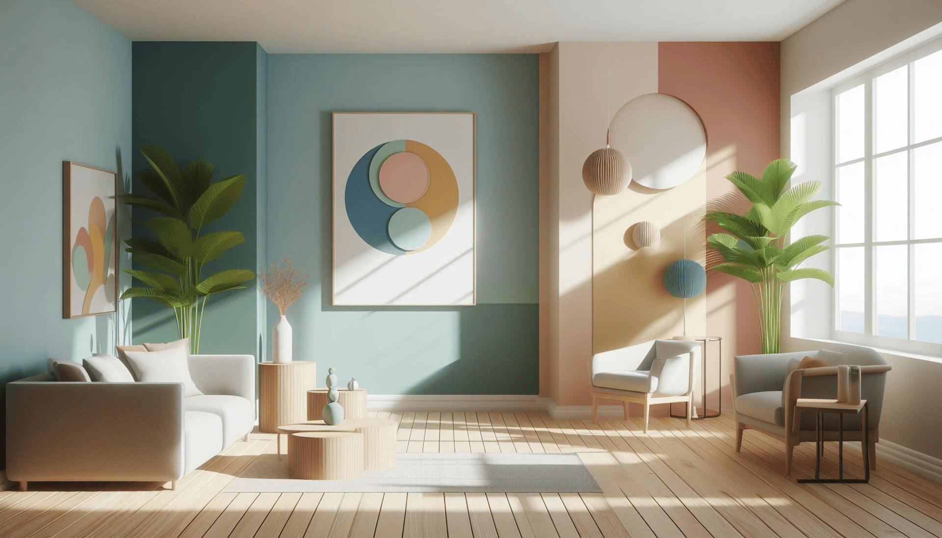
The intersection of architecture and psychology: Creating a sanctuary through intentional color selection.
The Physiological Weight of Color
Heart Rate Regulation: Studies in environmental psychology suggest that exposure to soft blue and green hues can lead to a measurable decrease in resting heart rate during periods of high stress. Cortisol Suppression: Environments utilizing "Biophilic" colors (earthy greens and browns) are associated with lower salivary cortisol levels in adults. Cognitive Focus: Strategic use of low-saturation yellow in workspaces has been shown to increase task endurance by reducing visual fatigue.
The Spectrum of Emotion: Deconstructing the Palette
To build a mentally healthy home, we must categorize colors not by "fashion," but by their psychological "weight."
1. The Energizing Warmth (Red, Orange, Yellow)
Warm hues are characterized by their ability to stimulate the sympathetic nervous system.
Red: Increases blood pressure and metabolic rate. While powerful, excessive red can trigger feelings of agitation or even aggression. In a mental health context, it should be used as an "accent" rather than a primary wall color.
Yellow: The color of optimism and intellect. It stimulates the left side of the brain (logic). However, high-saturation yellows can cause ocular fatigue if used in large, unbroken planes.
Orange: A bridge between the intensity of red and the cheer of yellow. It promotes social interaction and warmth, making it an ideal "social lubricant" for dining areas.
2. The Restorative Cools (Blue, Green, Violet)
These colors are the cornerstones of stress-reduction design.
Blue: Perhaps the most vital color for mental wellness. Blue lowers the pulse and encourages deep, meditative breathing. It is the ultimate "serenity" hue.
Green: The bridge between the physical and the psychological. Because the human eye is most sensitive to green (as it signifies life and abundance in nature), it requires the least amount of effort to process, making it the most "restful" color for the eyes.
Violet/Lavender: Associated with spirituality and introspection, these tones are excellent for spaces dedicated to mindfulness or creative journaling.


Curating a restorative palette: The power of low-saturation, cool-toned pigments
Room-by-Room Architecture for Mental Wellness
A successful mental health design strategy requires a "zonal" approach. You cannot use the same emotional frequency for your home office as you do for your bedroom.
The Bedroom: The Zone of Circadian Reset
The primary goal here is Melatonin Production. To facilitate sleep, the environment must signal "safety" and "shutdown."
Strategy: Use low-LRV (Light Reflectance Value) colors. Darker, muted blues or deep forest greens help create a "cocoon effect," reducing the visual stimuli that keep the brain alert.
The Home Office: The Zone of Cognitive Flow
The goal is Focus without Fatigue.
Strategy: Avoid overly vibrant reds which cause "distraction fatigue." Instead, opt for soft teals or pale yellows. These colors maintain alertness while allowing the mind to enter a state of "Flow."
The Living/Social Space: The Zone of Connection
The goal is Vitality and Presence.
Strategy: Use the 60-30-10 Rule. 60% should be a neutral base (to prevent overwhelm), 30% should be a calming secondary color, and only 10% should be your "energetic" warm accent.


The transformative power of color: From visual agitation to environmental tranquility.
The "Invisible" Designers: Neutrals, Light, and Texture
While color is our primary tool, it does not act alone. To create a truly profound impact on mental health, we must consider the "support staff" of design: Neutrals, Lighting, and Texture.
The Cognitive Relief of Neutrals
In an era of digital "noise," our brains are constantly processing high-frequency information. Large expansary areas of neutral colors—whites, beiges, creams, and soft greys—act as Cognitive Buffers. They provide "visual silence," allowing the mind to rest between periods of intense activity. This is why "Minimalism" is not just an aesthetic choice; it is a mental health strategy to reduce sensory overload.
The Alchemy of Lighting
Color is nothing without light. The Color Temperature (measured in Kelvin) can completely alter the psychological impact of your paint.
Warm Light (2700K-3000K): Enhances the intimacy of oranges and yellows but can make blues look "muddy" or unappealing.
Cool Light (5000K+): Makes blues and greens crisp and energetic, but can make a cozy living room feel "clinical" or cold, potentially increasing feelings of isolation.
The Tactile Dimension: Texture as "Color Depth"
Texture provides the "soul" to color. A flat, matte blue wall may feel cold and sterile, but a blue wall paired with a heavy linen curtain or a chunky knit throw introduces tactile warmth. This prevents a room from feeling "two-dimensional" and adds a sense of security and grounding.


The transformative power of color: From visual agitation to environmental tranquility.
Implementation Strategy: Designing on a Budget
You do not need a full renovation to reap the neuro-aesthetic benefits of color. The most effective changes are often the smallest.


Step-by-Step Implementation
Identify the Room's Function: Is it a place for rest, work, or socializing?
Audit your Light: Observe how your current walls look at 8:00 AM versus 8:00 PM.
Introduce "Micro-Doses": If you are afraid of bold colors, start with an accent chair or a single piece of vibrant art.
Embrace Biophilia: Whenever possible, pair your color palette with natural elements—plants, stone, and wood. The synergy between color and nature is the ultimate way to create a "healing" environment.


The ultimate goal: Creating a personalized sanctuary that nurtures the soul.
Conclusion: The Intentional Home
Designing for mental health is an act of self-care. It requires us to move away from the reactive decision-making of "what looks good on Pinterest" and toward the proactive intention of "what makes me feel safe, focused, and whole."
By treating our homes as biological extensions of our nervous systems, we can harness the profound power of color, light, and texture to create more than just beautiful spaces. We can create sanctuaries—places that not only house our bodies but actively nourish our minds.
Frequently Asked Questions (FAQs)
1. What is the best color for reducing anxiety in a home?
Soft, muted tones are most effective. Specifically, light blues and sage greens are scientifically linked to lower stress levels because they mimic natural, calming environments (Biophilia).
2. Can dark colors cause feelings of depression?
While dark colors like navy or charcoal can create a sense of "cozy intimacy," excessive use in small, poorly lit rooms can lead to feelings of confinement or gloom. The key is balance—using dark colors for depth while maintaining light-reflecting surfaces.
3. How do I use vibrant colors without overstimulating my space?
Use the 60-30-10 Rule. Use a neutral color for 60% of the room (walls), a secondary calming color for 30% (upholstery), and save your vibrant, energetic colors for the final 10% (cushions, art, or vases).
4. Does color affect sleep quality?
Yes. High-energy colors like bright red or orange can keep the brain in a state of high alertness. For optimal sleep hygiene, bedroom walls should ideally feature low-saturation, cool-toned colors to signal the brain that it is time to wind down.
5. How does lighting affect the psychological impact of color?
Lighting alters the "temperature" of a color. Warm light (yellowish) can make a room feel cozy but may hide the crispness of blues. Cool light (bluish/white) can make a room feel clean and energetic but may make warm tones look dull or "dirty."